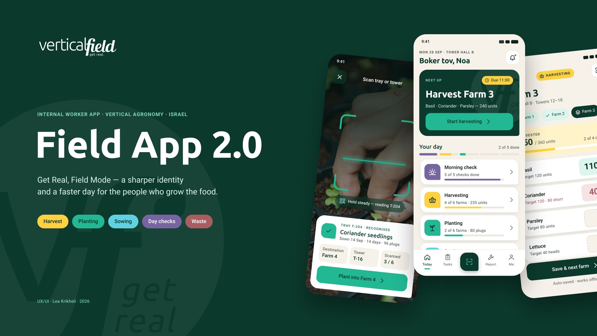
Vertical FieldRedesigning the internal app that vertical-farm workers use all day, so every screen answers one question: what do I do next?
Role
UX, UI and visual identity
Company
Vertical Field · vertical farming
Timeline
2023 original · 2026 redesign
Scope
Worker app · components · prototype
Screens are a 2026 redesign of my original 2023 designs, rebuilt in Figma. Names, farms and numbers in the screens are sample data.
Problem
The 2023 app covered the right tasks, but it was hard to read, spent a fifth of each screen on a header, and never told workers what to do first.
What I did
Audited my own 2023 files, gave each brand colour a job, and rebuilt the app around one next step, a scan button and large number entry.
Result
24 screens, a component library and a clickable prototype of a full shift. It has not been tested with workers yet.
The problem
The right tasks, in the wrong shape
Vertical Field grows herbs and leafy greens on vertical farms. Its operators use an internal app to log the day: opening checks, harvesting, planting, sowing, packing, waste and service calls. I designed that app's interface in 2023. Three years later I went back to it.
The 2023 app modelled the work well. It just didn't help anyone move through it.
The task structure was sound and stays: daily tasks by action, then by farm, then by crop. What got in the way was the surface on top of it.
I'm assuming operators use the app standing up, often in gloves, under coloured grow lights. Hypothesis I haven't observed a shift, so the redesign treats this as a working assumption.
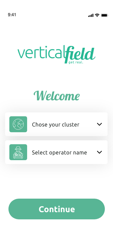
2023 · Log in
Two dropdowns to find yourself
Script headline is hard to read
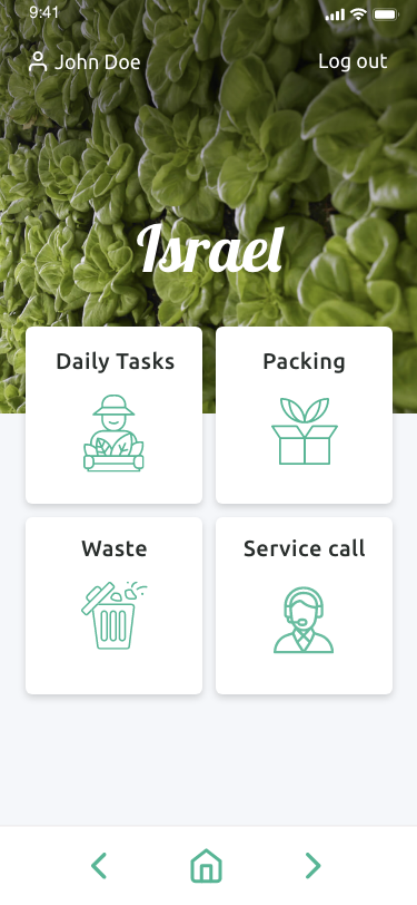
2023 · Home
Four equal tiles, no first step
Thin icons, large photo header
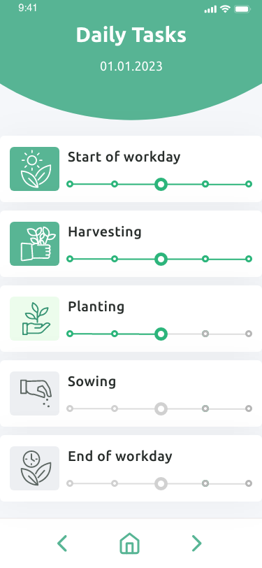
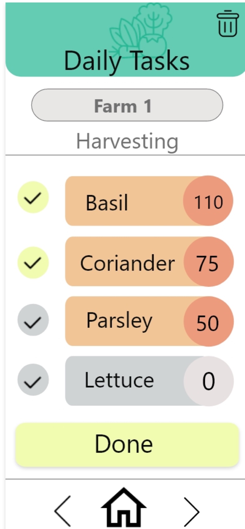
2023 · Daily tasks
Header takes 15–21% of the screen
Progress dots don't say what they count
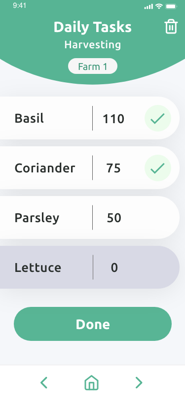
2023 · Harvest entry
Back / home / forward bar instead of app navigation
The grey "0" row reads as disabled
CauseDecoration before directionCurved headers, pale green and equal tiles treat every screen and every task the same.
EffectWorkers have to navigateNothing says what is next, what is done, or what came in short.
OpportunityLet the app leadOne next step per screen, colour that means something, and numbers large enough to read at arm's length.
Who it's forFarm operatorsNursery and sowingPackingMaintenance: plumber, electrician, AC technician, agronomist
Audit
What my own 2023 files told me
There was no research budget for a self-initiated redesign, so I started with what I could measure: the original design files.
71
artboards in the 2023 prototype file, read one by one to map every screen and link
15–21%
of the screen height taken by the curved header, on every screen
2.2 : 1
contrast of white text on the 2023 header green. WCAG AA asks for 4.5 : 1
0
screens that tell the worker which task to start with
SourceMy 2023 Adobe XD files and exported screens. Header height and contrast measured on the exports (header colour #67BFA5).
The core idea
One next step.A worker in the middle of a shift shouldn't have to navigate. Every screen should answer "what do I do now?"
Process
From a client wireframe to a second version
The project began in 2023 with a design task: two wireframes from the client, to be turned into UI that follows the brand guidelines. The redesign in 2026 started from those same files.
2023Design task
Client wireframes, four versions of the daily tasks screen, then the full app in Adobe XD.
01Audit
Every artboard and prototype link in the XD files, plus the brand guidelines.
02Identity
Colour, type, shape and icons, turned into variables and styles.
03Components and screens
Buttons, task cards, crop rows and a tab bar, then 24 screens built from them.
04Prototype
A full shift, from log in to shift closed, clickable in Figma.
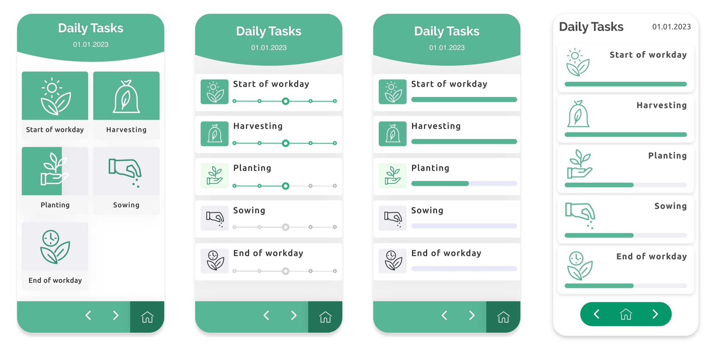
2023: four versions of the daily tasks screen. The second one, with progress dots, became the app.
Evolution
The same two screens, three times
Daily tasks
From a list of equal rows to a screen that picks the next task for you.
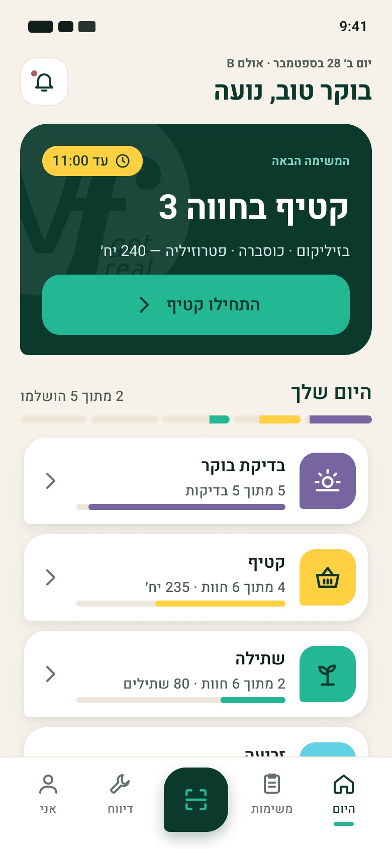
A "Next up" card with a due time and one button
One colour per task type
A tab bar with Scan in the middle
Swipe →
Client wireframeThe back / home / forward bar is already here.
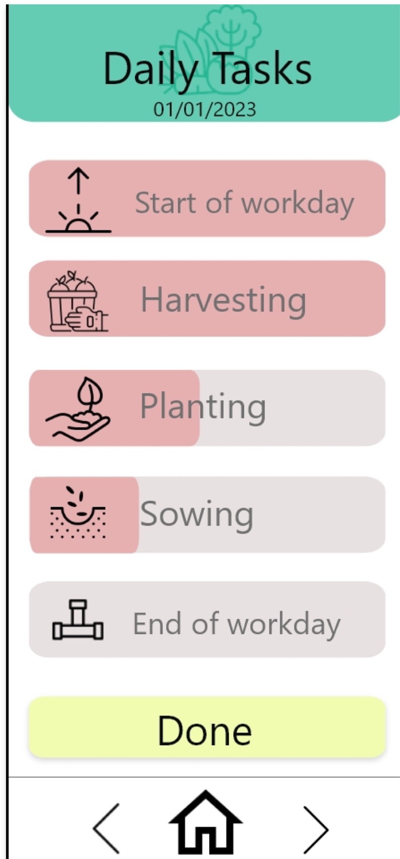
2023On brand, but every row carries the same weight.
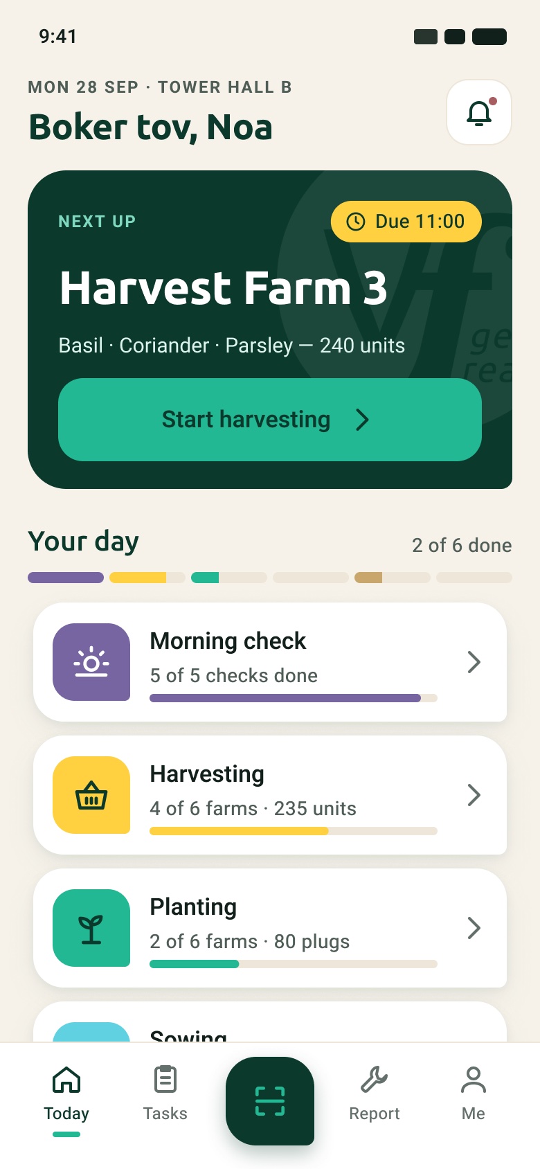
2026The next task leads; the rest of the day sits below.
Harvest entry
From a list you tick off to a list you type into.
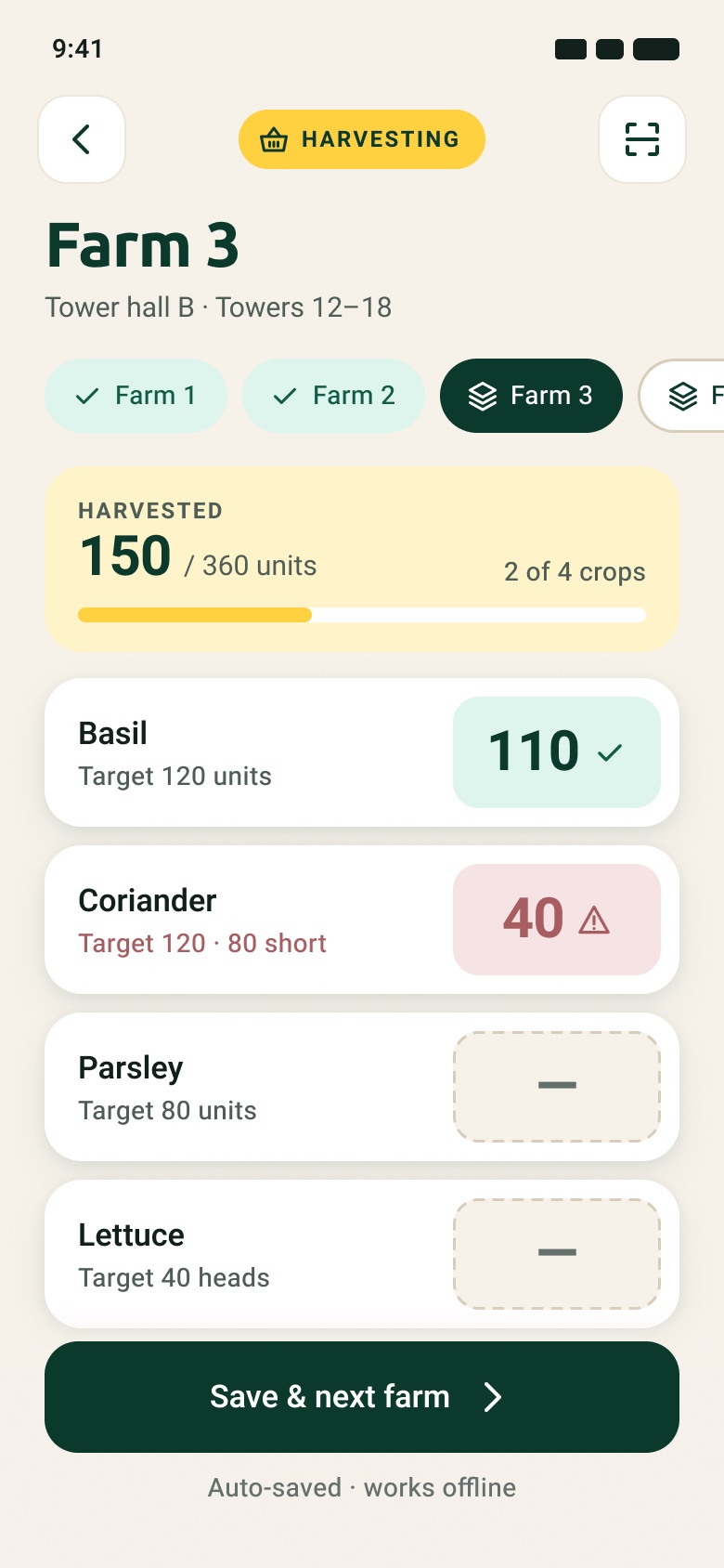
Amounts are the largest text on the screen
Empty reads as "to do", not as disabled
A short harvest is flagged against its target
Swipe →
Client wireframeCrop, amount, check.
2023Cleaner, same model.
2026Targets, totals and farm switching in one place.
Design direction
Same brand, put to work
Vertical Field's guidelines already had what the app needed: five colours, two typefaces and a distinctive logo. The logo and the brand green stay. Everything else gets a job.
Canopy (new)#0B3A2C for text, dark surfaces and the main buttons
Real Green (brand)#21B893 as a surface for primary actions, never as small text
Kraft (new)#F6F2EA background, borrowed from the brand's kraft packaging
InkThree text greys, all tinted green
Day checksReal Tech #7665A0
HarvestReal Joy #FFD141
PlantingReal Green #21B893
SowingReal Change #60D1E0
WasteReal Soil #A85D61
PackingKraft #C9A66B, added
The five brand colours become a task code. Each task type owns one colour across cards, tags and progress.
The leaf corner
The logo mark is a circle with one pointed tail. Cards, tiles and the Scan button borrow it: three round corners and one sharp one. It flips to the other side in Hebrew.
Two typefaces, two jobs
Ubuntu, from the guidelines, for titles. Heebo for body text, labels and numbers, because it covers both Latin and Hebrew. The script typeface stays out of the app.
Icons that survive small sizes
34 icons on a 24px grid with a 2px stroke. They replace the detailed line illustrations from 2023, which lost their detail at 24–32px.
Readable first
I checked each text colour against the background it sits on. All pairs used for text pass WCAG AA (4.5 : 1).
The check also caught two of my own choices: a tertiary grey and a warning red that failed. I darkened both before writing this.
Pair
Use
Contrast
AA text
AaCanopy on Kraft
Titles, amounts
11.4 : 1
Pass
AaInk 600 on Kraft
Secondary text
6.2 : 1
Pass
AaInk 400 on Kraft
Small labels
4.6 : 1
Pass
AaWhite on Canopy
Dark cards, buttons
12.7 : 1
Pass
AaCanopy on Real Green
Primary button
5.0 : 1
Pass
AaCanopy on Real Joy
Harvest tag
8.7 : 1
Pass
AaWhite on Real Soil
Waste tag
4.8 : 1
Pass
AaWhite on Real Green
Not used
2.5 : 1
Not for text
The app
A shift, start to finish
24 screens cover the same work as the 2023 app. These are the moments that changed most. Click any screen to see it full size.
Start
Log in by face, then one clear task
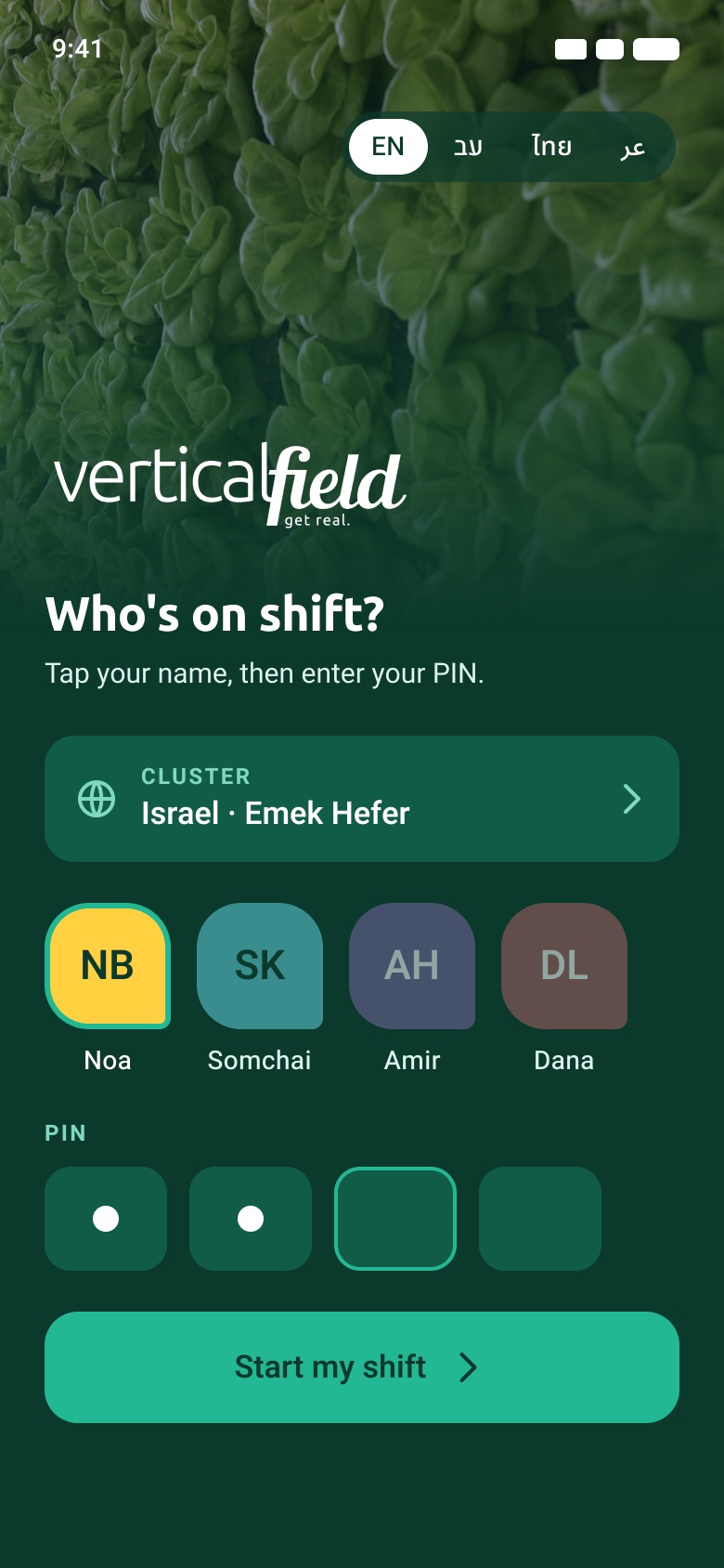
Operators tap their name and enter a PIN instead of scrolling two dropdowns. The Today screen opens on a "Next up" card with a due time and a single button; the rest of the day sits below as colour-coded tasks.
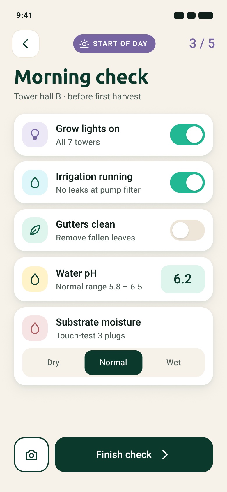
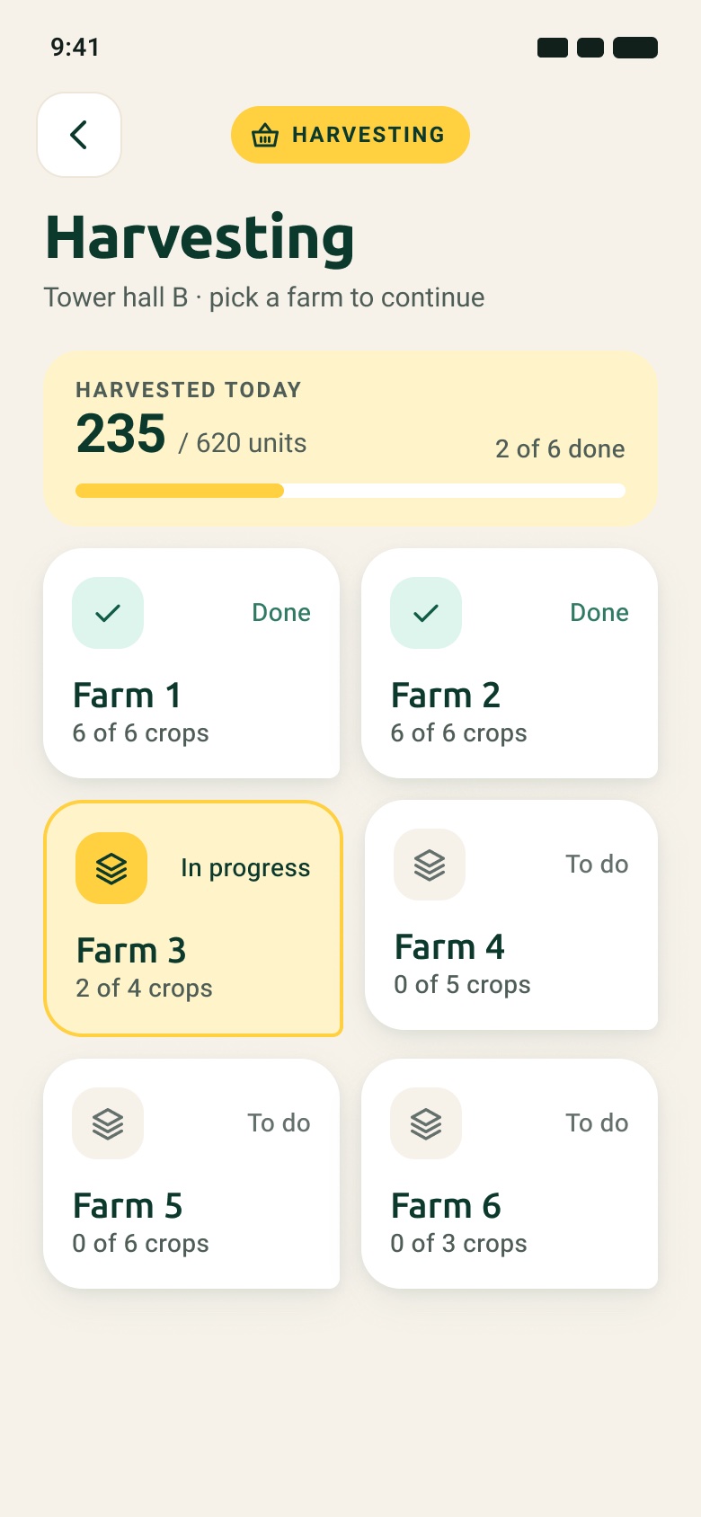
Log inTap your name, enter a PINTodayThe next task, then the whole dayMorning checkLarge toggles instead of small checkboxesHarvesting by farmReal progress per farm
Harvest
Numbers you can enter with one hand
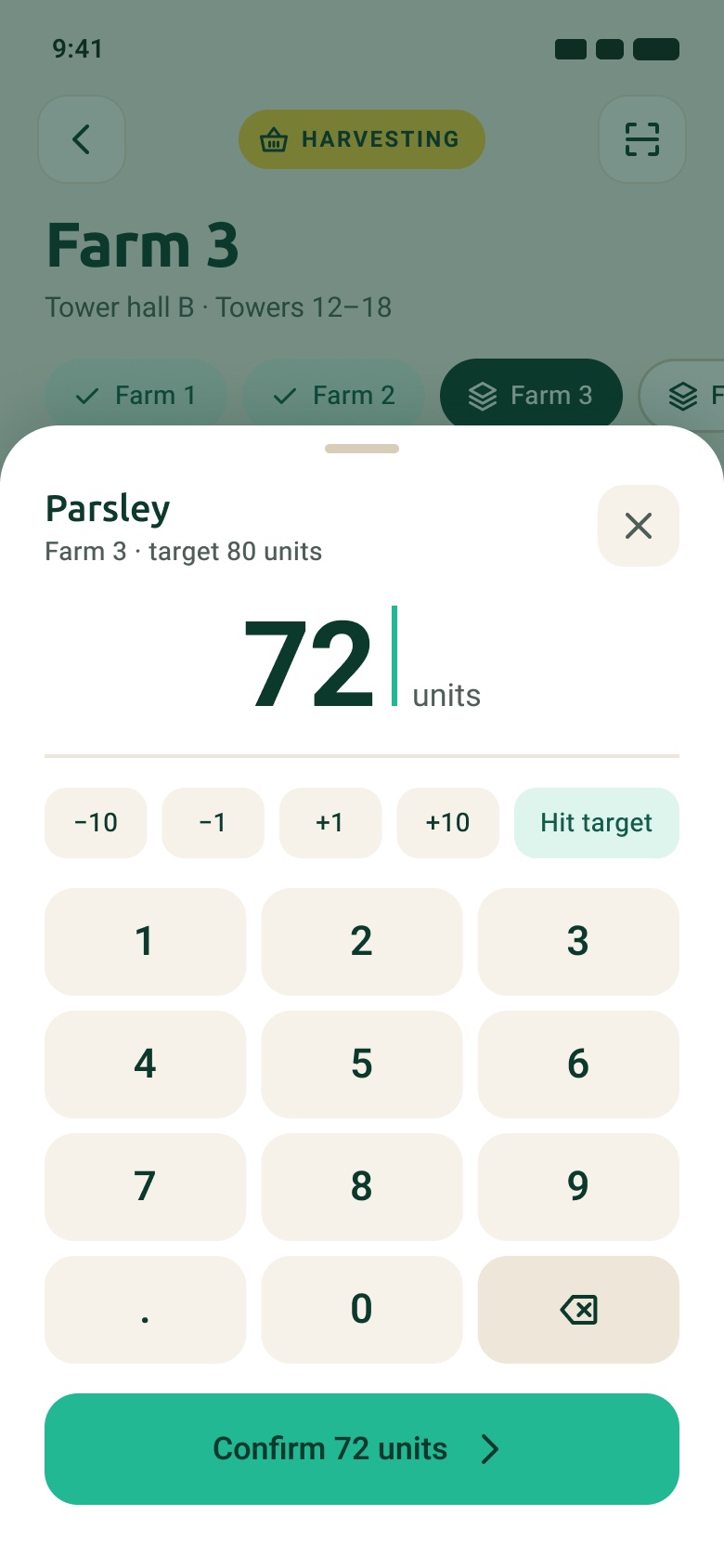
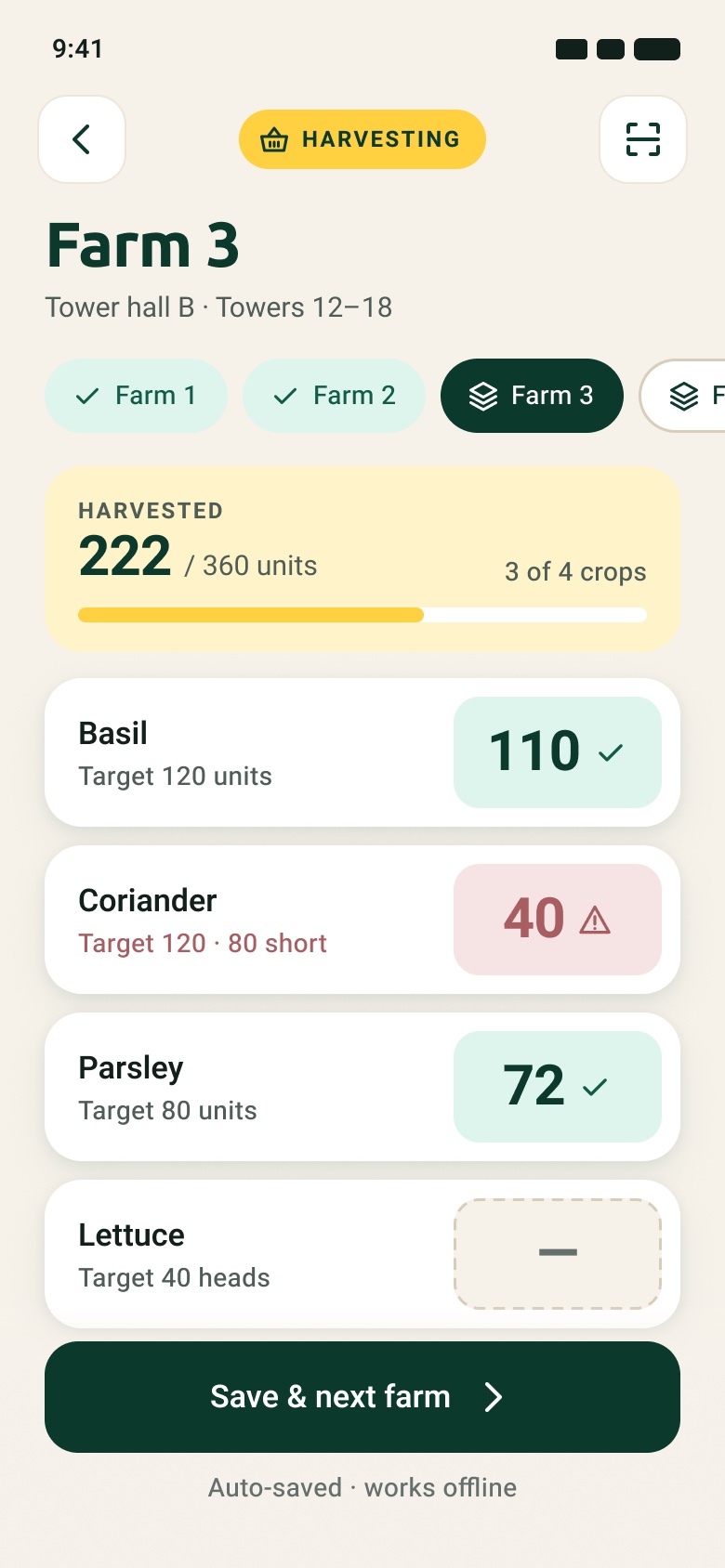
Amounts are entered on a number pad that slides up over the farm screen, with ±1 and ±10 nudges and a "Hit target" shortcut. Totals update as soon as an amount is confirmed, and an amount below target is flagged in place.
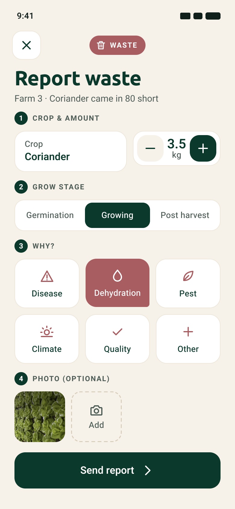
Farm entrySwitch farms without going backNumber padLarge keys, nudges and "Hit target"UpdatedTotals change straight awayReport wasteOpens from the short crop: amount, stage, reason, photo
Scan, plant, sow
The QR code does the navigating
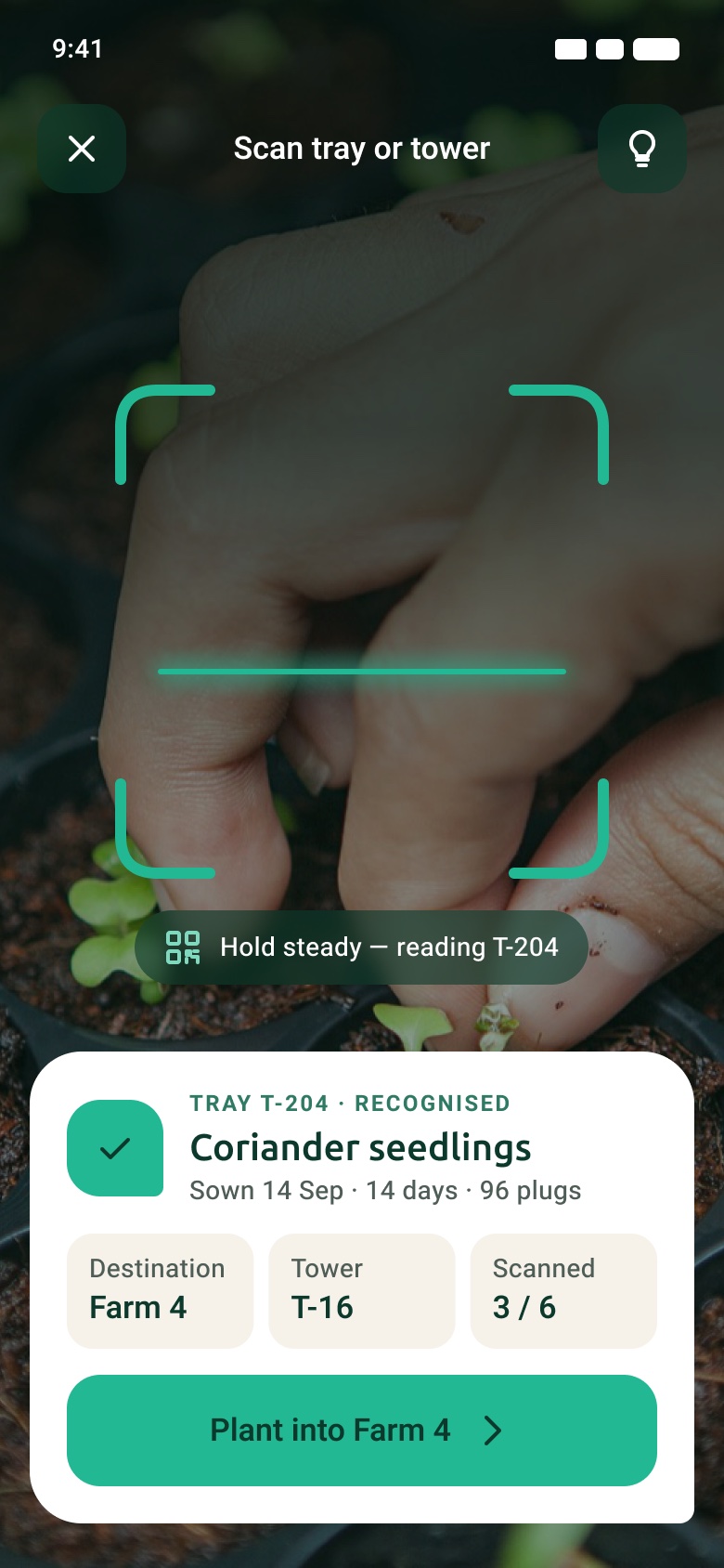
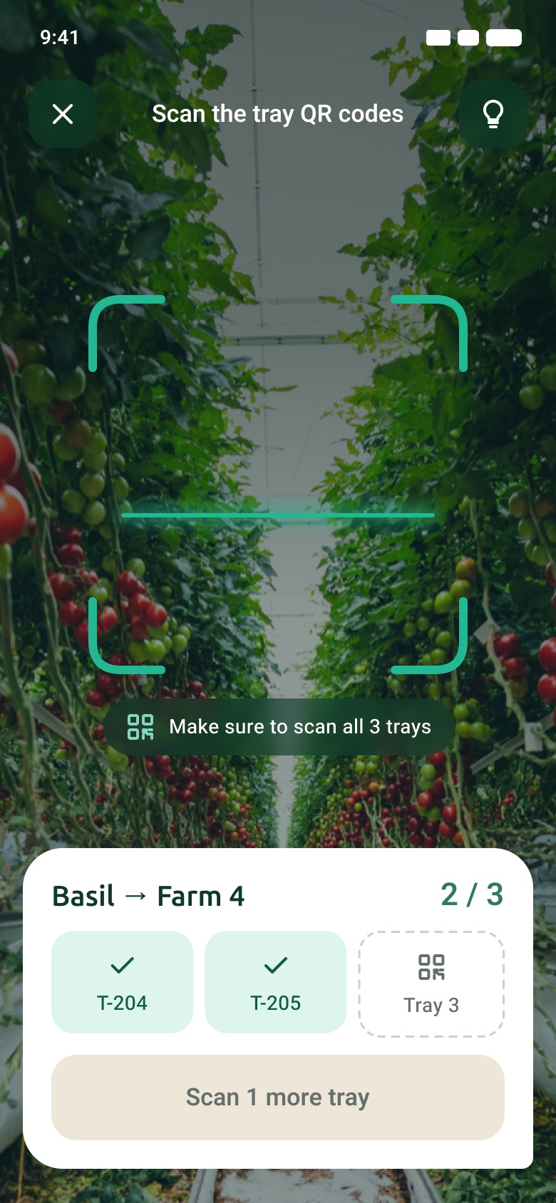
Scan sits in the middle of the tab bar. Scanning a tray opens the right task with crop and destination filled in. When several trays are needed, a three-slot tracker shows what is still missing.
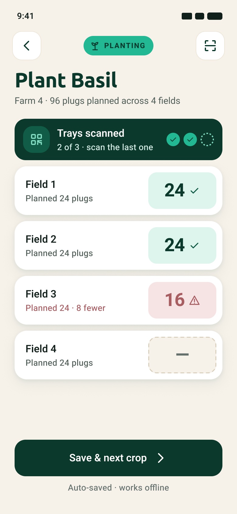
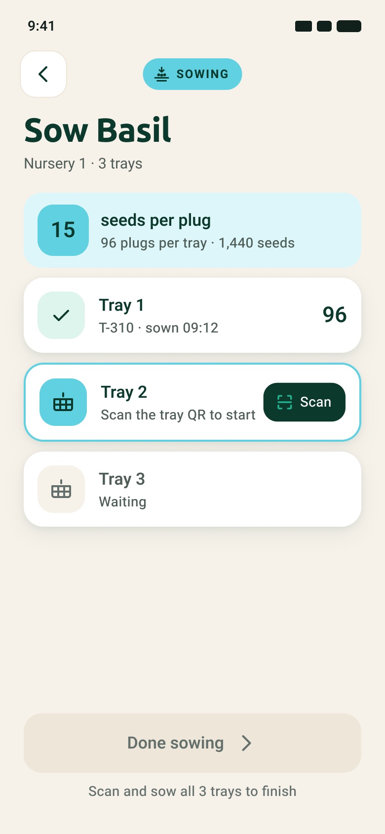
ScanThe tray says what to do with itPlant by fieldFields are rows, tray progress on topSeveral traysA tracker instead of a warning textSowThe seed recipe is the headline
When something is off
Reasons and service calls in a few taps
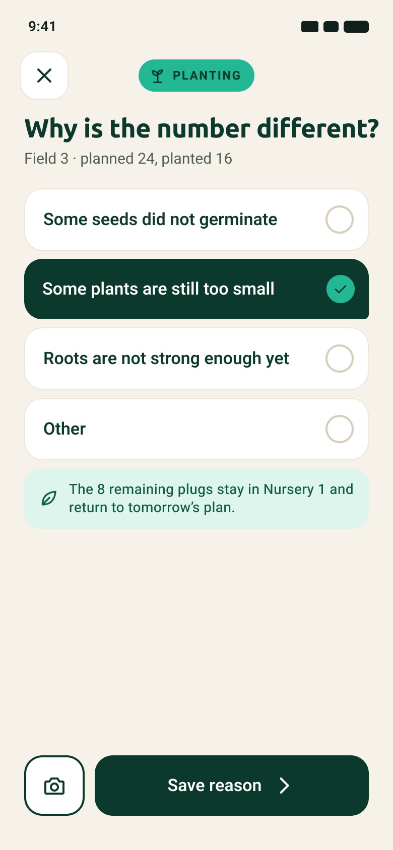
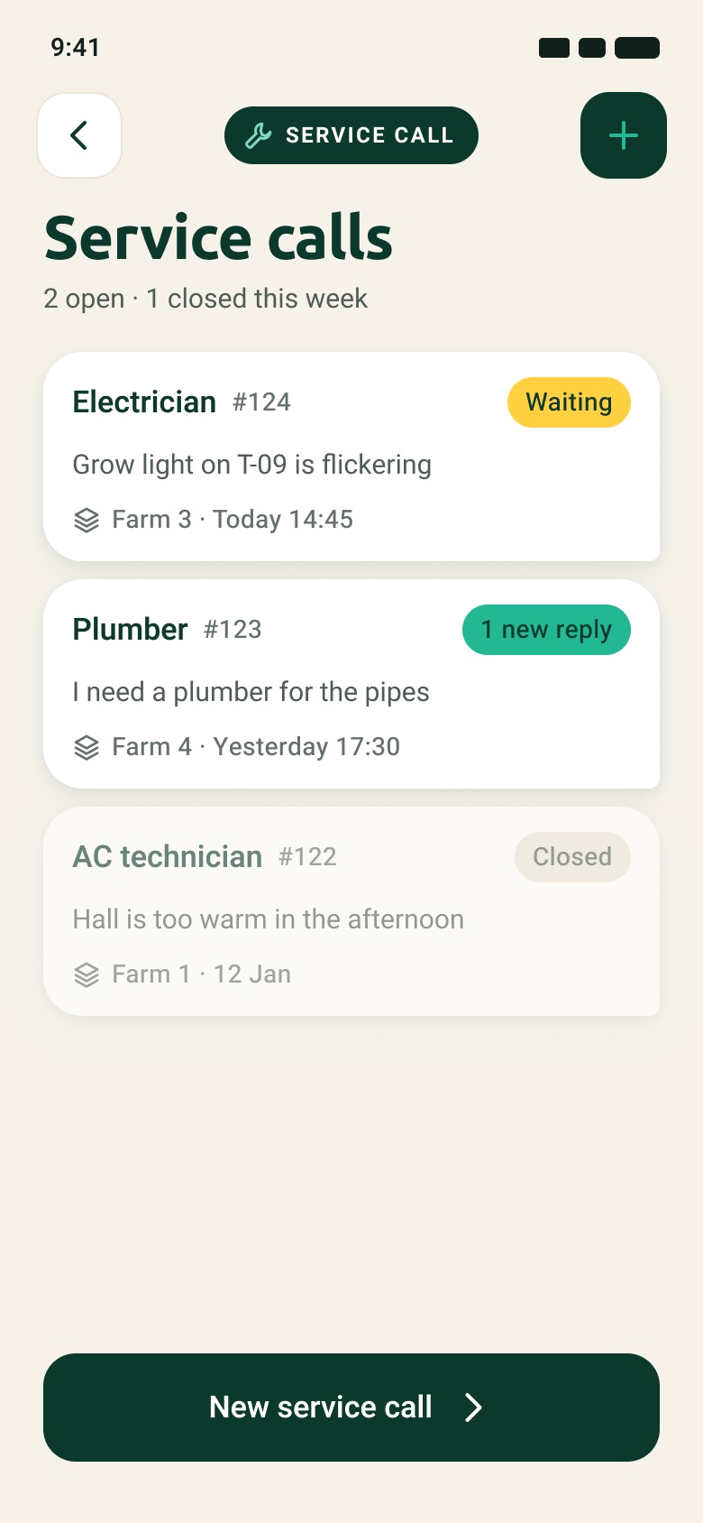
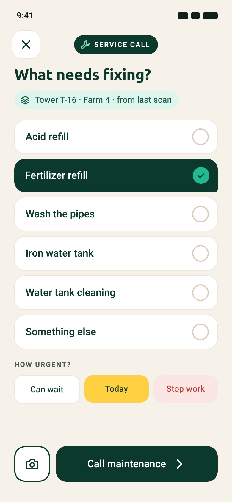
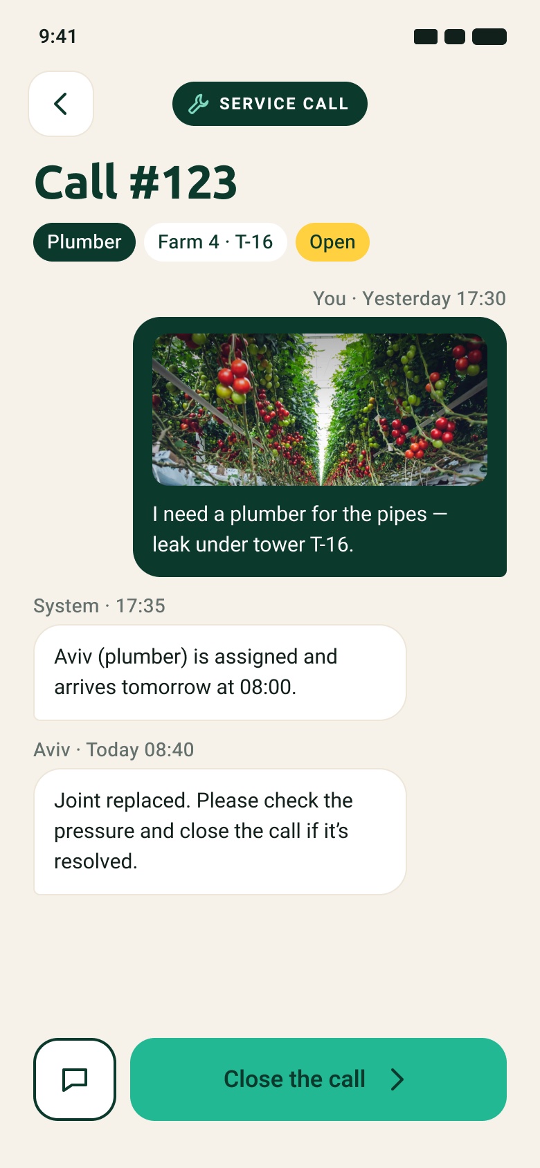
If fewer plants go in than planned, the app asks why and says what happens to the rest. Service calls show who is waiting on whom, and a call reads as a conversation with one primary action: close it.
Change in quantityShown only when planted ≠ plannedService callsStatus says whose turn it isNew callLocation comes from the last scanCall detailA thread, then "Close the call"
Pack and close
Orders with a truck time, a day with an ending
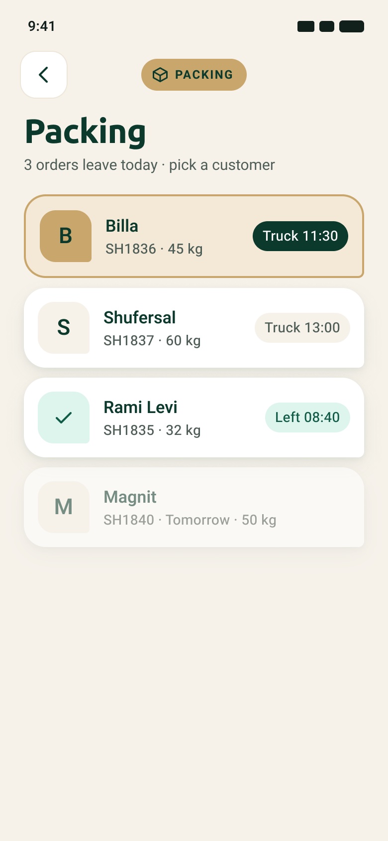
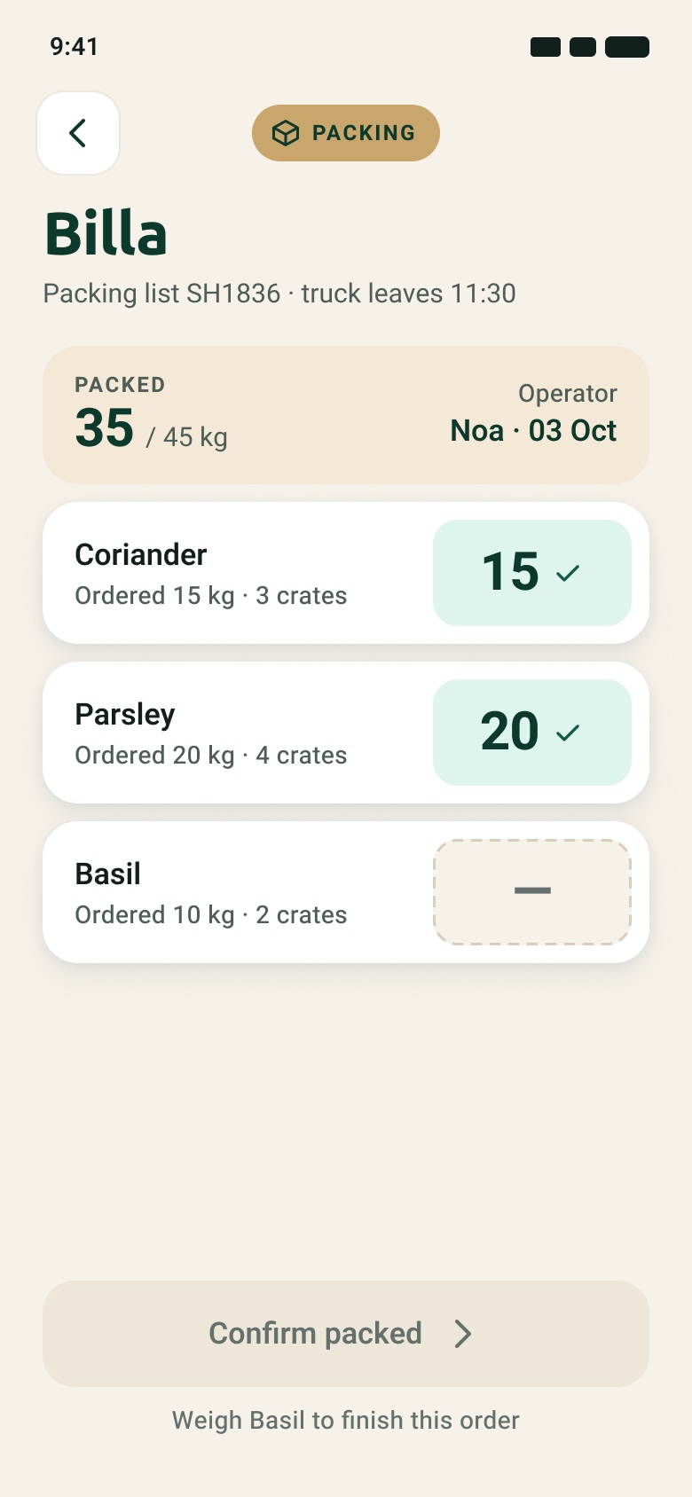
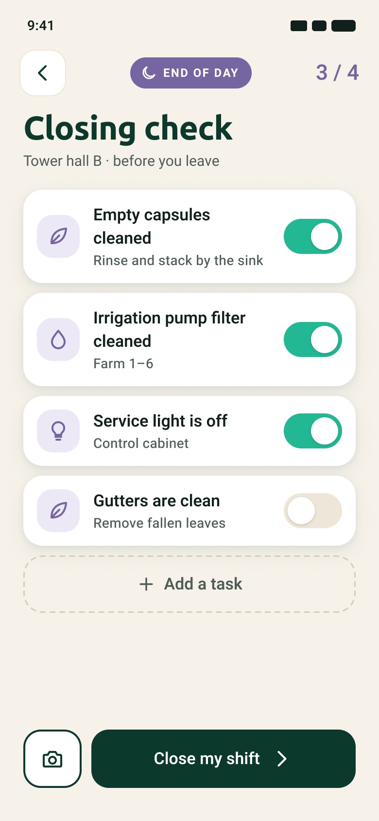
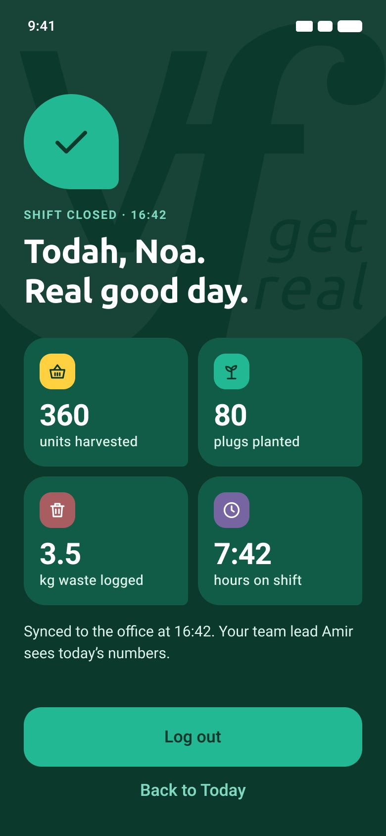
Packing lists become checklists you weigh into, sorted by when the truck leaves. The closing check mirrors the morning one, and finishing it closes the shift with a summary of the day.
OrdersCustomer, weight and truck timePacking listConfirm only when completeClosing checkThe same pattern as the morningShift closedThe day in four numbers
Hebrew
Mirrored, not translated on top
The Today screen has a full right-to-left version: layout, progress bars and arrows are mirrored, the leaf corner flips, and the logo watermark stays as it is. The log in screen also proposes a language switch for mixed crews. Proposal
EnglishLeft to rightHebrewRight to left, set in Heebo
Key decisions
Four choices that shaped it
01
A tab bar instead of back, home, forward
The three-arrow bar came with the client's wireframe and I kept it in 2023. It moves through history, not through the app.
2023
Back · Home · Forward
Same bar on every screen
2026
Today · Tasks · Scan · Report · Me
Hidden inside a task, so the task has one way forward
Trade-off
Inside a task there is no tab bar, so leaving takes a tap on Back first.
02
Brand colours as a task code
The 2023 app used green for nearly everything. Giving each task type one brand colour lets the day be read from across the screen.
Trade-off
White text on Real Green is only 2.5 : 1, so green became a surface with dark text. Packing needed a sixth colour that the guidelines don't have.
03
A number pad in a sheet
In 2023 the amount screen replaced the list. In a sheet, the farm stays visible behind it and the worker never loses their place.
2023
Full screen, placeholder help text
Small round keys
2026
Sheet over the farm
Crop and target on top, ±1 / ±10, "Hit target"
Trade-off
The sheet covers most of the list, so only the farm name stays in view.
04
Connect a short harvest to the waste report
Waste was a separate area on the home screen. Now the crop that came in short opens the report with crop and farm already filled in.
Result
One report covers amount, grow stage, reason and photo, which were separate screens in 2023.
Outcome and reflection
What exists now, and what it still needs
This redesign is a design proposal. It is built and clickable, and it has not been in front of a worker yet.
24
screens, rebuilt from the 2023 artboards
68
prototype links covering a full shift, from log in to shift closed
34
icons, plus buttons, task cards, crop rows and a tab bar as components
2
reading directions: English and a mirrored Hebrew screen